Charts
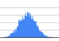
Frequency distribution chart
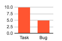
The frequency distribution chart displays the number of tickets aggregated by the given variable
Line chart
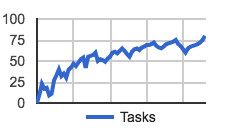
The frequency distribution chart displays the cumulative number of tickets aggregated by the given variable over time
Activity chart
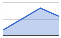
The activity chart displays a time series chart with the main user interactions, e.g. issues created, issues resolved, issue updates, and comments
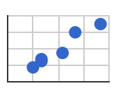
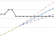
Bubble chart
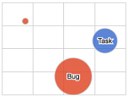
The bubble chart displays a data set with three dimensions. It plots two numerical fields in cartesian coordinates and the third field is used to group the tickets

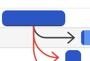
Created vs. resolved chart
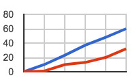
The created vs. resolved chart displays the total number of tickets created and resolved in the given time frame
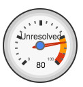
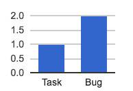
Numerical measures chart
This chart calculates descriptive measures (mean, min, max, sum) of the selected field
Numerical measures comparison chart
This chart calculates descriptive measures (mean, min, max, sum) of the selected field grouped by the given independent field